
Configuration
Customize the translation widget with themes, brand colors, positioning, and display variants.
Configuration
Customize the Translation Widget to match your brand and user experience requirements.
Open Translations in appAppearance Options
Configure these options in the Ours Privacy dashboard under Translations when creating or editing your widget.
Position
Control where the floating button appears on the page:
| Position | Description |
|---|---|
bottom-right | Bottom-right corner (default) |
bottom-left | Bottom-left corner |
top-right | Top-right corner |
top-left | Top-left corner |
Theme
Choose a color scheme:
| Theme | Description |
|---|---|
light | Light background with dark text (default) |
dark | Dark background with light text |
Brand Color
Set a custom accent color for the button and highlights. Use any valid hex color:
#2C73D7(default blue)#0057FF(brand blue)#FF9900(orange)- Any hex color that matches your brand
Widget Variants
Choose how the floating button displays:
| Variant | Display | Best For |
|---|---|---|
| Compact | Flag + language code (e.g., 🇺🇸 EN) | Most sites (default) |
| Extended | Flag + full language name (e.g., 🇺🇸 English) | When clarity is important |
| Minimal | Flag only (e.g., 🇺🇸) | Space-constrained designs |
Modal Variants
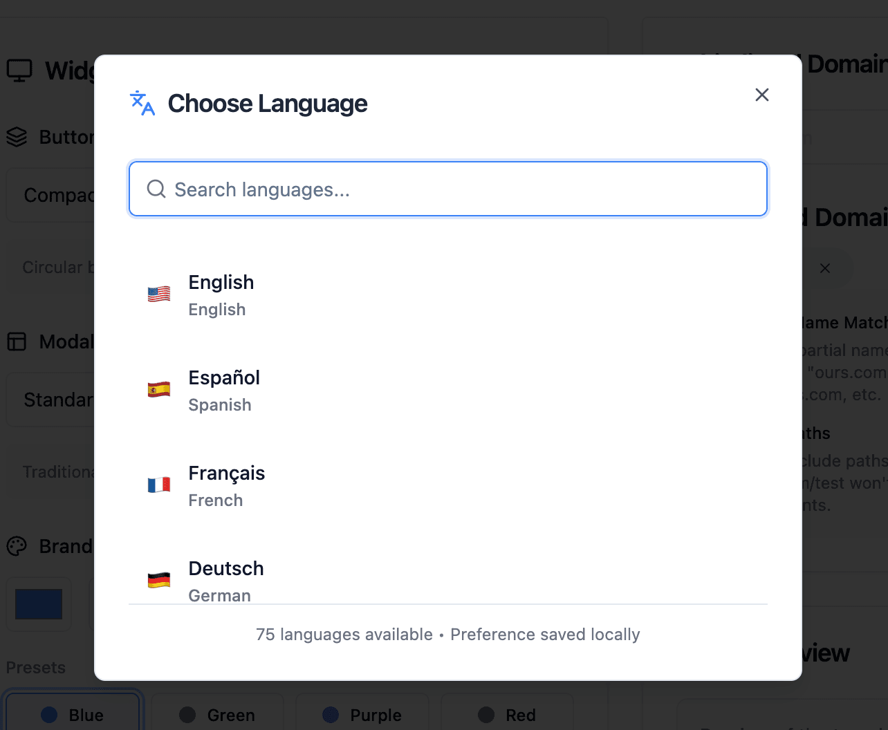
Choose how the language selection modal appears:
| Variant | Display | Best For |
|---|---|---|
| Standard | Vertical list with search | Many languages (default) |
| Grid | Grid layout of language options | Visual selection |
| Dropdown | Compact dropdown list | Minimal UI footprint |
How the options combine
Each view below is the same widget on the same page with a different combination of position, theme, brand color, and variant. All of them are dashboard settings — no CSS is involved.
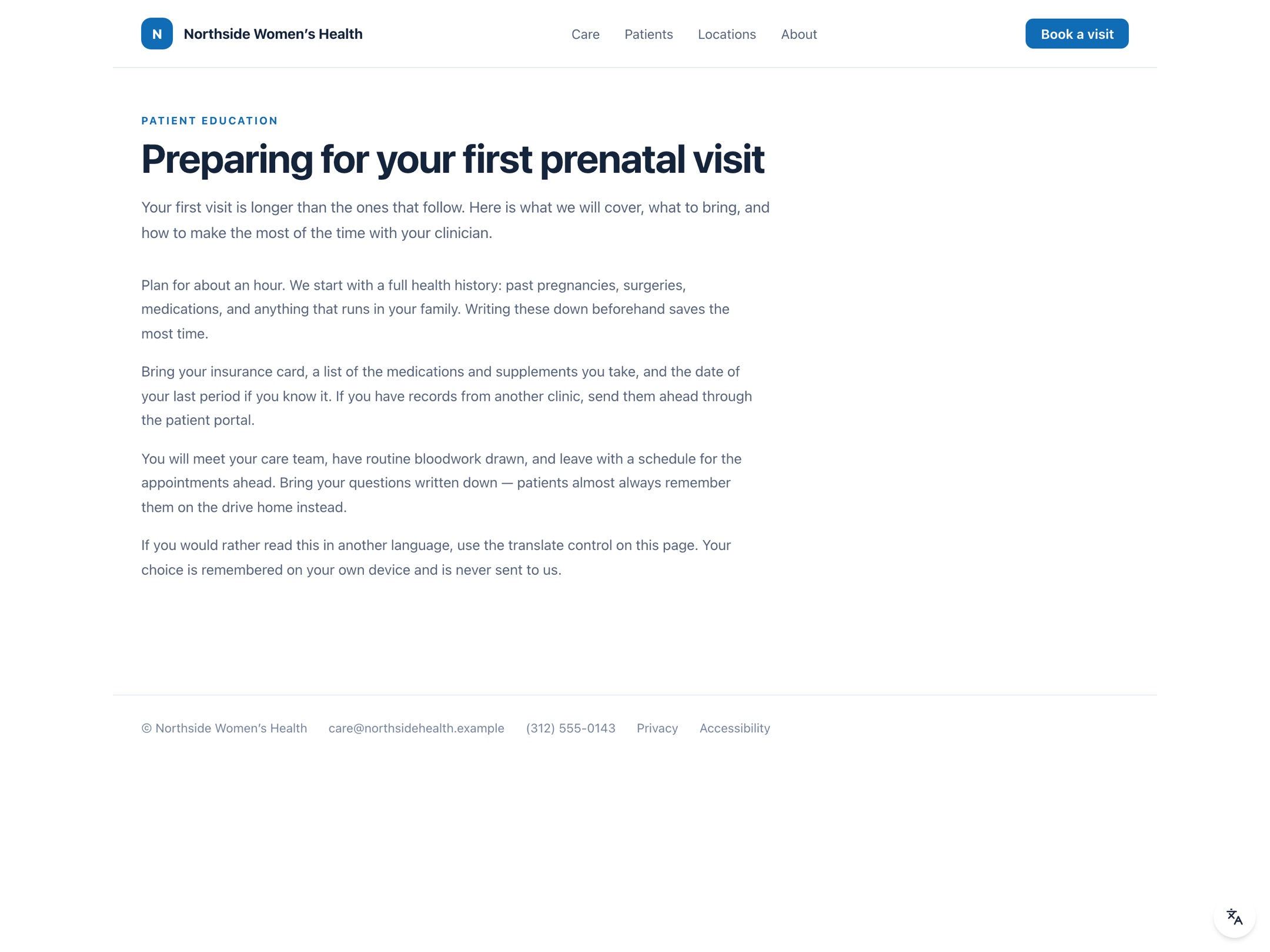
Compact, light. The default: compact variant, light theme, bottom-right. Before a visitor picks a language the button shows a translate icon; once they do, it shows their flag and language code.
Language Selection
Offered Languages
By default, the translation widget offers all 75 supported languages to your visitors. You can curate this list to show only the languages relevant to your audience.
To customize the language list:
- Go to Translations in the dashboard
- Open a translation widget
- Scroll to Languages Offered
- Click the dropdown to select specific languages
When languages are selected, only those appear in the widget. Leave the list empty to offer all 75 languages.
Considerations
- Your audience: Which languages do your visitors speak?
- Content relevance: Is your content applicable to those regions?
- Support capabilities: Can you support visitors in those languages?
Priority Languages
The widget automatically prioritizes the top 5 most common languages (English, Spanish, French, German, Chinese) at the top of the list, with remaining languages sorted alphabetically.
Example Configurations
Example 1: Multiple Languages
Position: bottom-right
Theme: light
Brand Color: #0057FF
Widget Variant: compact
Modal Variant: standard
Languages: en, es, fr, de, zh, ar, pt, ja, ko, vi
Example 2: Minimal Setup
Position: bottom-left
Theme: dark
Brand Color: #333333
Widget Variant: minimal
Modal Variant: dropdown
Languages: en, es, fr
Example 3: Grid Layout
Position: bottom-right
Theme: light
Brand Color: #2563eb
Widget Variant: extended
Modal Variant: grid
Languages: en, es, zh, vi, tl, ko, ar, ru
Z-Index Handling
The widget automatically detects the highest z-index on your page and positions itself above other elements. This ensures the widget remains accessible even on pages with complex layering (modals, sticky headers, etc.).
Next Steps
- Protect brand names and terms from being translated
- Exclude specific content from translation
- View all supported languages
- Track usage with analytics
How is this guide?